Pages

Friday, December 16, 2016

Graphic Design Reflection 2016

What did I do this semester?

Raccoon

Our first Illustrator project was to follow a tutorial to create a raccoon, and then make the raccoon our own by adding various different decorations and accents. Then, we incorporated our raccoon into a postcard. This took a couple weeks to complete since learning Illustrator takes a while, and designing a post card can take a lot of time and effort. Sometimes when I was using certain pathfinder tools, Illustrator just wouldn't cooperate, and I would have to find some other way around. Along the way I learned how to use a bunch of different Illustrator tools, such as path finder tools and warp effects. My peers told me that they really liked my post card, and that it was really cute. Eventually, though, I had to change the background because when it came back from being printed it was too light and it was hard to see some of the other things on the card. Overall I'm really proud of the work I did on my raccoon, and it's one of my favorite projects

Vector Portait Challenge

After we had completed our self portrait vectors, we were told to choose another person or animal that we liked, and then we had to create a vector portrait of whatever we chose. I chose a shiba inu, because they're one of my favorite dog breeds. This took my a couple days since by then I had figured out how to use Illustrator, and it was also a small project. One of my biggest challenges was getting all of the "polygons" lined up so there weren't any see-through spots on the dog. Along the way I learned how to create "low-poly" pictures in Illustrator. My friends told me that they thought it was super cute, and when I put it on another art website it became pretty popular for a little bit. I had to change some of the "polygons" since they weren't shaped like try polygons if you looked close enough, and that was bothering me. This is probably one of my best works in graphic design this year, and I'm really proud of it.

How did I use my time in class?

In class I really tried to maximize the amount of time I had in class, since there was so much to do with certain projects. I would often stay past the bell just to finish up whatever I was working on. If I finished a project early, we often had options for extra credit, so I would work on those projects. Outside of class I managed to get Illustrator at home and I really like messing around with Illustrator at home.

What are my strengths and weaknesses?

Strengths

I think that overall I'm really good at getting to work on my projects and finishing on time, and if I don't finish it on time, then I work hard to get it done as quickly as possible. I also feel like I learn quickly, and if you give me something new to do then I'll have no trouble picking it up.

Weaknesses

I often have a hard time coming up with inspiration. Almost all of my projects use the same or similar color scheme, and I feel like I could expand my horizons a little bit.

Summary

What did I love most about the semester?

I really loved just getting to use Illustrator more than I did last year. Last year I barely even got to learn how to use Illustrator, but now I know how to use it effectively.

What would I change?

I would probably change the amount of tutorials we had to do. Our teacher didn't really teach us anything, but she had us look at tutorials instead. I feel like if we had more time of our teacher actually teaching us, then our class might have done even better this semester.

Biggest take-away from the semester?

I learned a lot about project management this semester. I usually get really distracted when working on projects in other classes, but recently I've found that I've been able to just sit down and work better.

My goal for next semester.

My biggest goal is to be able to expand my design horizons. As I previously mentioned, most of my projects involve the same color schemes, and I'd like to change that.

Final thoughts.

I just feel like I've been really productive this semester. I'm super proud of everything I've done, and I've learned a lot along the way.

Animation Portfolio Reflection 2016

Worm

One of the first projects we made in animation was using the puppet pin tool in After Effects. What we did was first draw a worm in Photoshop, and then import the image into After Effects. Then we used the puppet pin tool to apply spots where the worm could move, and used key frames to make it look like it was moving. I picked this project because it was the project that really taught me how after effects works with the key frames and such. I feel like I did a really good job on drawing the worm in Photoshop, but I could have done a better job on where I placed the puppet pins, because at some points in the animation the worm does some weird stuff with his body. With what I learned for this projects I'm probably going to try and use the puppet pin tool more, since I don't really use it that often. I really like this project because I like what I made the worm look like.


Walk Cycle

When we made our walk cycles I learned how to time animations and how to set up key frames for a walk cycle. I picked this project because I'm really proud of my characters design and the background. I feel like I did a lot of work on my character's design. I probably could have made her less stiff though, since she doesn't move a lot. I'm going to apply more walk cycles to my animations with what I learned when making this animation. This is probably one of my favorite projects, just because of my characters design and how much work I put into the whole animation.


Hammer

After we were done with After Effects, we started using Maya. The hammer wasn't my first Maya project, but it was probably our first major one. Here we learned how to use the multi cut tool and the extrude tool by making our hammer's head and the part that comes out on the back. I picked this project because even though it was stressful, I was really proud of what I had made in the end. My greatest strength with this project was probably making the nails, since I didn't have any instructions on how to make the nails; I just did it on my own. With what I learned here I'm able to use the extrude and multi cut tools more easily since I know how they work now.


Ice cream

When we made our ice cream, the only really new thing we learned was how to add bump maps to our materials, which adds a sense of depth and texture to your objects. We also learned how to animate in Maya, but that was pretty easy as it uses key frames just like After Effects did. We put the bump maps on the ice cream and the cones. For a while my bump maps would move awkwardly while it spun, so I needed to figure out how to make them spin with the rest of the objects. I feel like I could have done something to make the lighting better, since it's really dark in my scene. 


Pen

Our most recent project, and also part of our final, was to model the pen we were using to take notes in class. Luckily, I had a pretty easy pen to model. When I was making my pen, I didn't really learn anything new, since we were using skills we had already learned, but I may have figured out easier ways to do certain things. I picked this project because it's probably the thing I'm most proud of from this semester. I think I did a really good job on making the pen proportionate to what it looks like in real life, but I feel like I could have done a better job on making the clip part of the cap. Making this pen has really helped me be more independent in Maya, since we didn't have a tutorial or anything on how to make a pen, since we all had different pens.

Sunday, December 11, 2016

Artificial Intelligence Generated Animation

A critique of this article by Selina Cheng.

Recently, famed animator Hayao Miyazaki was shown an animation which was generated through artificial intelligence. The animation showed strange movements, some of which had "zombies" crawling across floors in grotesque ways. Miyazaki expressed extreme discomfort and disappointment when he remembered a friend who has a disability, and has problems simply trying to give high-fives. He believes that this form of animation is "an insult to life itself" and that the people who created it have no idea what true pain is.

My thoughts

Cheng believes that Miyazaki's reaction isn't that surprising, as many of his works display characters with a lot of depth to them, abd are based on
"progressive themes like war, environmental issues and feminism".

Cheng's article is short and to the point. The issue- Miyazaki's opinions on AI animation- is clear. The article, however, lacks much of a conclusion other than stating Miyazaki's plans for coming out of retirement. Cheng also didn't seem to take a side on the matter, and only displayed Miyazaki's thoughts. The fact that Cheng doesn't think Miyazaki's reaction is surprising may mean that she agrees with him, and finds his opinions easy to understand.

I feel as though Miyazaki's thoughts should be taken into consideration. He did have a very extreme reaction, but the point he made of his disabled friend is important, and people should be careful when they create AI programs.

Conclusion 

Cheng's article helped shed some light on Miyazaki's thoughts. Though without the inclusion of the video, the article might have not made much sense.


Saturday, December 10, 2016

Potion Shop Review

Potion Shop

Potion shop is a thesis film by Temmie Chang. While Chang did the animation, she had the help of many others, including Toby Fox, who composed the original piece playing in the background of the animation. Chang's animation tells the story of a cat who runs a potion shop, but seems to be having issues getting any business until she saves the day by driving off a young dragon. Though all seems well, it is not, and the cat goes to make amends with the dragon, and in the process make new friends. The story is told through great character design and personality, talented animation and an expressive soundtrack.

Thoughts

The first thing that really stands out to me about this short film is the colors. The colors Chang decided to use really fit well with the given situation, and when the plot turns darker, the colors follow suit. On my next project this is something I would like to try and use, as I thought it really brought out parts of the story.

I also noticed that Chang used a multi-plane when showing the town at the beginning of the story to give depth to the animation. This is one of the first things we learned in class, and it really helps to show that different parts of the scenery don't all move together, and are further away from one another.

I feel as though when the crowd was shown running up to the cave, Chang could have improved that bit by animating the crowd a little more than just having them as a mass of color moving towards the cave. This is something I noticed is common in American animation, and it may have been an issue with time since Chang seemed to imply that this took a while to make in the description of the film.

Conclusion

Overall, I thought that this short film was super cute, and really well told. The colors and design were appealing to the eye, the soundtrack was fantastic, and the story was interesting. Chang's other work seems to all be really well made too, and I'm excited to see more from her.

Thursday, December 8, 2016

How to create an insect/arachnid walk cycle in After Effects

Creating a walk cycle for a creature with more than two legs may seem difficult, but its as simple as making a human walk cycle, with just a few extra steps.

1, Have a creature with 6 or 8 legs

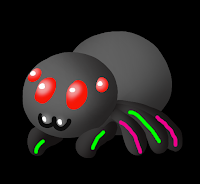
I will be using my spider from my story animation. I know my spider looks like it has only 5 legs but that's because the other 3 legs are behind the rest of the body, so I decided not to show them. It doesn't really matter if it has 6 or 8 legs, because the middle pair of legs will just be able to move on its own. I have highlighted the legs that will eventually be paired together, since arachnids and insects legs move like human legs, but in pairs.

2, Pairing the legs

The legs can be paired together using the whip tool in After Effects. Drag the whip tool from the middle green leg to the front green leg, and the back pink leg to the middle pink leg. Now when you set up your key frames on the first and second legs, all of the other legs will follow.

3, Key frames

The key frames on a walk cycle make the shape of a "D" on its side when looking at the path. Create a key frame where the first leg is moved to the right a bit, then another with the leg moved up and to the left, then another with the leg moved down on the same plane as the first key frame to the left. Copy and paste the first key frame so that  the leg goes back to where it originally was. You now have a full cycle.

4, Copying and pasting key frames

Once you have your key frames for the first set, all you have to do is copy and paste the frames from the first set to the second set, and then move them so that those frames start in the middle of the first frames, so that your legs don't move at the same time. If you make more copies of the frames you can have a longer walk cycle.

5, Watch your walk cycle

Your walk cycle should look similar to mine. Notice that the legs move opposite of each other. I hope this tutorial helped!

Tuesday, November 29, 2016

Which type of cat is best for you?

Our most recent graphic design project was to create an infographic based on whatever we wanted as long as we a did actual research on our subject. I chose to try and make a flowchart based on which breed of cat would belong with which type of person.

Concept

In the beginning I knew I wanted to do something having to do with cats. I love cats, and I've always wondered if there are certain cats that would work best with certain people. So I decided to research how the most popular house cat species behaved, and then matched up their personalities with what people might be looking for in a cat.

Process

Creating the flowchart proved to be difficult. I had all of the information down, but had trouble trying to fit them evenly in the space I had. I decided to have each box either be an inch or half an inch long, and then have them fit onto different tiers. I didn't want my flowchart to be messy and just spread out everywhere; I wanted order in my work, and I think that was what made trying to fit all of the information together hard. Eventually though, I did figure out a good layout, and filled up any blank spots with silhouettes of different cats.

My vision

When I started trying to come up with what I wanted to do, I know I wanted the final product to be cute, since I think cats are really cute and that colors that are typically deemed cute tend to be pleasing to the eye. I went with rather rather light pink colors for the different decorative pieces such as the borders around the boxes and the cat silhouettes. For the wording I chose a bolder, darker pink so that reading it would be easy. I tried to make the background simplistic so that it didn't distract from the viewers from the actual flowchart, but I added transparent white circles so that it wouldn't be boring either. I'm very happy with how my final piece came out, and I feel like it stayed true to what I initially wanted.

Thursday, November 10, 2016

Story Animation

Another thing we did recently (before we learned about Maya, actually) was create our first story animation with After Effects. This was, by far, one of the biggest and most stressful things I've done in all of e-Comm so far, other than the big group projects we did last year, but I'm proud that I powered through and proud of my work.

Pre-Production

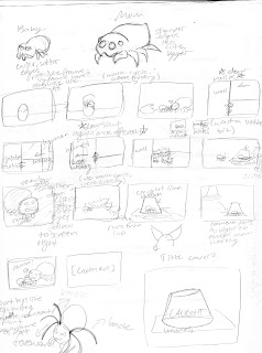
My storyboard
When our teacher first told us that we would be writing a short story, and then animating it, I had millions of ideas flying through my head. My main thought was that I wanted something cute. I remembered a spider that I had found in my bathroom several days prior, and how I had put them on a piece of paper, under a cup, and let him outside. I thought of what might have been going through the spider's mind, and what they thought when they got outside. I realize that spiders don't raise their offspring, but keeping with the "cute" theme, I thought up a small spider family, made up of a mother and child, living in a human's bathroom.

Production

Storyboarding for this was fun; I love spiders and I love drawing them. I really liked the way my designs looked on paper, but unfortunately my digital art skills aren't as good and they didn't translate well onto the computer. My story, however, was overshot. I set my standards a bit too high for myself and my abilities. I had to shorten and simplify my story once I hit production because of time limitations, which made me a bit upset, but what can I do when it's my first major project in my sophomore year of high school animation.

Trouble with After Effects

Finished baby spider design
Another bit that made creating this so stressful was working with After Effects. After Effects was easy for me to manage when I had a few different layers and such, but once you throw in more than one character, backgrounds with five plus layers, and multiple different scenes, things get troublesome. Once I had finished creating my backgrounds and characters, I needed to figure out a way to put it all together into a story, which was very overwhelming. Eventually, I calmed down and thought it through. The final project did eventually come out and I'm very proud of the work I've done for my first big project in this class.

Post-Production

After almost everyone else in class had finished their animations, we watched and critiqued each other. There were no harmful words towards each other, only what we liked, and thought needed work on our animations. I was told that mine was well done, though there were somethings that I needed to fix, such as some timing issues and objects that didn't fit the aesthetic of the rest of the animation. Unfortunately I wasn't able to get to any of these things since I had deadlines to meet.

Conclusion

I really wish I had set my standards lower for myself. That was probably the main cause of my stress, and the rushing of my project. I'm proud of myself for having overcome my stress and finishing the project, but I'm upset that I almost let the stress get to me. For our next big project I'll probably try to take things easier on myself and try to stay after and work on things at school.

Castle

My castle.

New program

Recently in animation we've been learning about Maya, a 3D modeling program. There's a lot that goes into Maya and learning how to use it, so we started out small and created a simple castle. 

Learning Maya

In order to learn to make the castle, we needed to first learn how to use Maya. We started out by learning what makes up shapes in 3D programs-- polygons. There are different simple shapes in Maya, such as the cube, sphere, and pyramid. These shapes are put together and modified to create more complex shapes, much like my castle.
A better look at the towers and moat.

Building the castle

The castle was our way of putting our knowledge of simple shapes into making complex shapes. We started out with a simple cylinder, which we then cut an area out of for guards or soldiers to stand with blocks extruding up from the top of the wall. Once we were done with one tower, we could copy and paste it to create three more. The walls were then added by creating a rectangular prism that was connecting two of the towers at the height you want your wall to be. After we made the base of the wall, we made subdivisions to have extruding out the top, much like the towers. We could then copy and paste the wall three times like we did with the towers and make a cube to cut out the gateway with.

Extra editions

After the base castle was built, we needed to add something extra. I decided to make a ground and a moat by making a rectangular prism and cutting out a hole, and then making another rectangular prism as the island the castle sits on.

Sand and water

Adding the textures was fairly simple, since all I needed to do was set up a shader to create some sort of depth, and then add a texture to said shader. I chose sand, to make my castle appear like a sand castle. The water texture and shaders were already built into Maya, and I didn't need to do any searching for textures.

Last thoughts

Creating the castle really helped me learn a lot about modeling in Maya. Currently, we are just beginning to learn about lighting, which has made my projects look a lot more life-like than what was seen in my castle's images.

Thursday, October 6, 2016

Raccoon

Original raccoon
We've finally done our first major project in graphic design! We worked in Illustrator to create a raccoon, which we would eventually use to create something even greater.

The Raccoon

When we were creating our raccoon, we were told that we needed to follow a tutorial to get the basics of the raccoon down, and then follow another tutorial to add berries, leaves, or acorns. Following those guidelines, we were also allowed to add our own personal touch to our raccoons. I decided to make mine pink, because I love pink since it's just a really soft, nice color.


Postcard front

The final product

Postcard back
After our original raccoon was finished, we were then told to apply it to a postcard. The postcard was supposed to celebrate something; a holiday, party, wedding, or anything else worthy of celebration. I chose a birthday theme, since I thought that would fit with my raccoon's pink color scheme. We also needed to have some form or written typography to our postcards, so I made a design that revolved around birthdays. The postcard will be professionally printed, and I plan on giving it to a friend for her birthday.

Sharing on the web

This project has also been uploaded on Adobe's website, Behance. On Behance, I hope to get more publicity for my work. You can add certain tags to your work that allow people to search within results of what they're looking for.

Monday, September 12, 2016

Beginning Graphic Design in Sophomore Year

Back into Graphic Design

For the past couple of weeks in Graphic Design we have been closely following tutorials in photoshop to learn the different tools and features.

In this image I removed the tag from the
 coat to make the image appear more professional.

Skills

We mainly used things like content aware fill, spot healing, and clone stamp to seamlessly take out different things from photos We did about ten different assignments  with these tools and to show them all would make my post cluttered, so I've only shown one example.

This one took a while; there was a lot to
 be done, and it needed to be done correctly.

Collage

The biggest project we did by far was the collage, where we took three images of a girl and made a senior photo-type collage of her. We had to do things like remove backgrounds, restore broken parts, resize awkward proportions, and even join two backgrounds together.
I chose a more nature oriented theme for my challenge.

Challenge

Our last assignment was a "challenge". We were given an image of a model, and were told to use what we learned in the videos to create a unique edit of the model. We could use any pictures we wanted, and were only limited by our imaginations.


Valuable information

A lot of what I learned from the video tutorials felt important, but what I found to be the most helpful was learning how to use layer masks. I knew about layer masks but I never really learned how to use them and how useful they could be. You can use them to show certain parts of a layer and hide other parts, so as you can imagine, it was very nice to finally get to use layer masks.

What would I do differently?

If I had the option to do all of this again, I would have gone back and watched more closely in the videos. Most of the time I was working with Photoshop and the video open side-by-side, so I was working along with the video. Maybe if I had watched the video first, and then went to work and referred back to the video when I needed help then I would have learned more, but that's just me.

What would I leave unchanged?

I really liked how the tutorials were set up, so there's a lot I would leave the same. Maybe have more of a choice for what we got to edit, then these tutorials would be more interesting.

Overall these tutorials were very useful, and if you are planning on going into a career involving photoshop then these skills could stick with you forever. Nothing felt like it didn't make sense or wasn't necessary.

Monday, May 16, 2016

Reflection Over e9

This blog post is dedicated to reflecting over what has happened over the past first year of my time in e-Comm. It will be long but it's good to reflect over what has happened, especially when you learn as much as I have in only a year of high school.

What have I learned?

Over the past year I learned many things about how to create digital media, such as videos, websites, animations, and graphics.In regards to animation, I learned first, how to use Photoshop and how to set it up for animation, and then I learned different techniques of animation. In video, I learned how to take different shots properly, and then edit those shots to make a video that looks nice and makes sense. We did web throughout all four quarters, and in web I learned how to use Dreamweaver to make html and CSS codes to make a website that has a good color scheme and doesn't look like a mess of poor coding. In graphic design, I learned more about color theory and how different elements of design work together to make something that looks nice.

How did I learn this?

I learned by listening to my teachers when they were giving demos and writing notes. I used my notes to help me along when I eventually got to make my own project. When I forgot how to do something, I could just look at my notes to help me figure out how to do something.

Why is it important?

This is important because these skills will help me through my next three years of high school and eventually help my in a computer career if I should choose one. These skills are also nice to have if you just feel like creating something, like I really like to use Photoshop to make different things like phone backgrounds and gifs.

What are my strengths and weaknesses?

I feel like my strengths lie in using Photoshop, whether it be for animation or graphic design. Photoshop was just made really easy to use, unlike Illustrator , which I feel like it was almost made to work against you, I'm so bad at it. I feel like I do an alright job in web design stuff, and video was never really my favorite thing.

What am I doing with what I have learned?

Most of what I do with these skills involves making edits and gifs in photoshop. I like to do this for things like different video games and T.V. shows and post them on websites like Tumblr and Twitter, or Facebook if I feel like showing my stuff to my family. (I'm not on Facebook, like at all.)

What would I change?

I would kind of like to change how we're taught. Sometimes teachers will sit there and demo for the entire hour and have us take notes, and it's just about as boring as watching paint dry. I appreciate being able to take notes, but maybe we could work WHILE the teacher demos, and take notes as we go, so maybe we have something more interesting to do? It's hard to figure things out because not everyone learns the same, but these are just my opinions.

In conclusion,  I really enjoyed my first year in e-Comm. My favorite part of e-Comm has to be working with Photoshop, since it's so easy to use and you can do so much with it. I feel like I've learned a lot, and that these skills will be useful in the years to come.

Friday, May 13, 2016

e-Comm Final Project: Product Creation

Color Vision Logo
Over the past several weeks we worked in groups to come up with a product and make graphics (logo, business cards, coupons, etc.) animation, website, and commercial to advertise our product

What was our product?

My team's product was a pair of glasses that allows people who are colorblind to see in color. Our team name was Color Vision, and we all worked together to make different attributes of our product.

Where did we excel? 

I felt like my team did best on our graphics. We each worked on different graphics, while I made the logo that would go on each of our different kinds of graphics.
Glasses made in SketchUp

Where did we struggle?

I felt like my team struggled the most with communication. We had group members that were gone often and we neglected to communicate that we would be gone, which made our group a little behind.

Things I would change or do differently:

Our group's commercial
I would really like to have the option to choose our groups; I didn't know a lot about the people in my group and being a shy person, I didn't open up a lot to them which I feel was a disadvantage.

How did I improve?

I feel like, despite being incredibly shy as previously mentioned, I did become a little bit better at working in groups. I have never liked working in groups because I'm one of those people who likes to have things my way, but I had to deal with that and go with other people's ideas.

Thursday, March 10, 2016

Photoshop Projects!

So many new tools!

We recently did four different, yet similar projects in photoshop to get us used to some common tools in Photoshop. We really made use of the clone stamp tool, and magic wand tools, which are some of my favorite tools to use.

 Project 1

Our first project was to crop a picture of our school that was provided to us. After we've cropped it we would then put a semi transparent logo for our school over it, and then an acronym for Olathe NorthWest.


Project 2

our second project was to edit different colors into a monarch butterfly's wings. I chose pastel colors, because I think they're easy on the eyes. After we chose our colors, we used the clone stamp tool to make the butterfly look like its flapping its wings.


Project 3

The third project was to use another pre-provided picture of our school, and this time use the text mask tool to have a selected area that says "Northwest". After we've inverted the selection, we needed to use the gradient tool to make a blue and black gradient around the letters.

 Project 4

The fourth and final project was to make a collage of different areas in our school, and our mascot, the raven. We used the layer mask tool to make the pictures look like they were floating over the school. We also had to use the clone stamp to take out some cars and light poles that looked out of place in the photo.

What did I learn

These projects taught me very basic, yet important and widely used tools in photoshop. These tools are very important to making even the simplest edits in photoshop.

Thursday, March 3, 2016

Invasive Species Website

For our web portion of 3rd quarter we made a website which showed the different invasive species across the united states. We were given the pre-written information and logos to put into our website, but the rest was up to us.

Body, with matching color scheme

What's new?

We used Adobe Dreamweaver to create our website. We followed a series of videos in order to learn new ways to make styles in css, and edit html coding. One of the first new things we learned was how to create a header, footer, body, and sidebar.
Sidebar with list of links

Sidebar

One of the main things I want to talk about is the sidebar, since so much went into it. For our sidebar, we learned how to use css and html to make a sidebar with styled links in a list. 

Color Scheme

For the color scheme of the website, I had to find colors that matched. I couldn't just choose a bunch of random colors that I liked, but looked terrible together. The colors have to go with what the website is trying to advertise, and the colors need to belong together.

Much of this was new.

Basically everything I learned to do in the process of creating this website was new to me. I had never learned how to make a footer, header, sidebar or body. I had never learned how to make a stylized list of links. This was almost all new. I did apply some of what I learned last quarter from making my own website, but that had been a while ago, so I had to re-learn some things as well. It wasn't hard; just very new.

Wednesday, February 10, 2016

The Orthogonal Cube

Orthogonal Cube

A super cool shape

The orthogonal cube is a super cool shape because it's so simple, yet incredibly iconic. It's sleek, an easy to make.

I'm not just going to talk about a shape, though

I really want to talk about the e-Comm. program and how incredible it is. In e-Comm you lean a ton about how computers work and different careers involving computers, such as animation, graphic design, web design, and video.

You start out in one of those strands, with web design put in throughout the program, and learn about that strand for a quarter, then move on to the next after that quarter.

Computer skills are important

You really learn a lot in the quarter you have with each strand, and sometimes you use skills from one strand, and apply them to the next. Even if you don't plan on going into a career based around computers, these skills can still be useful to know. Maybe you're making a business and you need to design a website, or a logo. Maybe you need to make a commercial for your business with an animation in it. You can also use skills from video to make that commercial.

Don't take special programs for granted

These programs are so helpful. From e-Comm. to Animal Health, all of these 21st Century programs can help you find a career, or provide job experience. It's smart to get into a class or program that provides real life experience and skills, because in the long run, you really will find those skills useful.

Monday, February 8, 2016

Introducing my personal logo

Finally!

I know; it's been three quarters of the year and I finally have a personal logo. Not my decision. This logo will later be made into a favicon for my blog as well, rather than some random image I found on Google.

Any meaning behind this?

Tons! The main thought I had for this was the idea behind the Japanese lucky cat, and how they're meant to welcome someone into a home or business. The shape the cat is holding is the coin in the traditional Japanese lucky cat, but min is larger, and has my initials on it.

Color choice?

The colors are meant to be calm and welcoming. The choice of pastels, I felt, was a good one because pastels are commonly used in things such as a child's room to make the room give off calm vibes. The pink represents love, youth, and passion, while the yellow represents sunshine. The white means purity, and is another calm color.

Why a circle?

Circles tend to represent coming together, or unity. I really liked that idea along with the soft, rounded edges to go along with the already calming colors! The spiral, which was also rounded with soft edges, is also the cat's tail, which comes around the entire circle.

Is it finished?

Most likely. I had several different ideas, both in my sketch book and on my illustrator art board. I'm pretty happy with it right now, but logos tend to change, and mine is likely no different. 

Friday, January 29, 2016

Famous Logo Creation

Re-creating famous logos

Our most recent project was to find one of our favorite famous logos, and find a tutorial to help us create it in Adobe Illustrator. I chose this tutorial to help me create the well known Google Chrome logo. The tutorial went through several steps of drawing shapes with the pen tool, copying them, rotating them, and filling them in with different colors

My Chrome logo

My Chrome Logo
My version of the chrome logo ended up looking like this. The tutorial used colors they found were close to the original colors, but I had the original logo on my art board with my version, and I was using the eyedropper tool to get the correct colors. Mine isn't nearly as detailed as the original, though. Mine is mostly flat colors, save for the shadows where new color begins, while the original has much more shading.

What did I do this for?

We are getting ideas for our own logos, currently, and to get some insight our teacher told us to get ideas on logo creation from tutorials. We need to be able to use Illustrator better before we get started on our own logos, so the tutorials help us find new tools and commands to help us use Illustrator more easily.

Monday, January 25, 2016

Anatomy of My Name

Anatomy? For words?

Much like the human body, words have anatomy too! Typography is used to show how words and letters are made up of different parts. Some fonts have parts that other fonts don't have, like Malayalam MN (the font in the image) doesn't have serifs, but Times New Roman does.

Meaning of fonts

The font you use also holds a lot of meaning. You can't write a serious Shakespearean esque poem and use Comic Sans. You need to chose a font that matches what you're writing. Fonts that are straight, have serifs, beaks, and rough edges are typically used for serious writings while rounded, spunky letters are usually used for more laid back writing.

This project

I was told to choose a font that I believed fit my first or last name. I thought Malayalam MN fit my last name rather well. Since my name is German, which is typically thought of as a strong, but not scary language, I figured I should use a font that was more serious, but didn't have things such as serifs or beaks.

Choose Wisely!

Your font choice needs to be thought out well when designing something. The font needs to match the feel and idea of what you're trying to advertise. If you were commissioned by someone to create a logo or advertisement, check with your employer to see what they're looking for. You don't want to hand them a logo that doesn't fit what they're trying to advertise.

Thursday, January 14, 2016

Color!

Our first project in Illustrator was to create a color wheel! This project was designed to get us used to Illustrator and to get us thinking about color and color psychology. We were told to look up "color wheels" on google and find the simplest one and recreate that as practice first. After we created our simple color wheel we were to find a more interesting one and try to recreate that.

My Color Wheel

Mine turned out like this: To do this I made one shape, and rotated 11 copies 30 degrees around the center. We were to show the primary, secondary, and tertiary  colors.

Color Psychology

Color has a lot of meaning behind it. Different colors can mean different things and ensue different emotions. Warmer colors tend to mean things such as passion, anger, love, danger, and intensity, while cooler colors tend to symbolize calm feeling, honesty, nature, health, freshness, purity, and life.

Colors in Advertising

People will carefully choose what colors they might use in advertisements, since colors can draw people to a product. If someone's trying to sell food, they may use red for desire, and if they're trying to sell gum or toothpaste, they may use green since when people see green they tend to think of mint or freshness. People will use colors that are associated with what they're selling, to try and get people to buy their product.

Lots of Meaning

A lot of thought tends to go into color choice. Color choice is typically inspired by emotion, and a person's favorite things. Most people will just choose colors they like, but usually there's a reason they like that color so much, right? The reason my blog's all pink is because it feels like a really organized color to me, since it's such a pretty color it feels like I can do a lot with it and organize it into different things to make my page look nice. Color is one of those things that has a surprising amount of emotion and thought behind it, but once you discover this it makes a lot of sense.

Thursday, January 7, 2016

What is Graphic Design

Graphic Design is used in almost everything we do. It's used for advertisement, media, menus, brochures, comics, and so much more. Most people can find some relation to Graphic Design in everyday life.

Game Posters:

Monument Valley
One of my favorite things to do is play mobile games on my phone. Monument Valley's poster is a good example of a really great design to get people interested in a game. It's simplistic, has colors that look nice together, and a character with very little detail to them. The small amount of detail might get people curious and make them want to play the game to find out more.

What drew me to this game?

I thought the poster for this game was fascinating. It's simplistic, has colors that look nice together, and a character with very little detail to them. The small amount of detail on this character intrigued me since I've always been attached to minimalist-type objects.

Counting by 7s
by Holly Goldberg Sloan

Book Covers:

Books are another great example of graphic design's presence in every day life. Many people choose to pick up a book based simply on it's cover, which is a valid response since well design covers are one of the many things that draw people to a book.

Why did I read Counting by 7s?

As I said before, I'm attached to simple objects. The cover of this book really only consists of three colors: white, teal, and red. While the cover is very simple, the red pops out somewhat, which really made me notice it at the library.

Why does this matter?

As said before, people are drawn to what they find pretty. A well designed poster or cover can make people more likely to use your product. People try to find something they can relate to: whether it be colors they like, shapes, animals, certain settings, or maybe even just words.