Our 4th Quarter project for Graphic Design was to re-design a local company's logo. I chose Strawberry Hill Povitca as my company. I tried to make a somewhat refined logo with warm and "sweet" colors, since politic is a sweet treat
Our logo was chose from a series of 6 different combination marks, each with 6 different color schemes for a total of 36 logos that we created by hand. It was a hard choice, but I felt like this one fit the most.
I based the letterhead, business card, and envelope off of the color scheme from the logo, so that the logo wouldn't feel out of place.
The letterhead was made to look interesting on both the front and the back to keep the reader interested and make it feel like they're not just reading another letter in the mail.
The business card is meant to stand out so that the employee can get more clients.
The envelope is also meant to stand out from all the bills that a receiver may get in the mail. If the envelope looked like another bill, then the receiver may not want to open it.
My favorite part of this project was creating the business card. I've always thought business cards were really neat and professional looking, and to get to design one was a lot of fun
Overall this project was a lot of fun. I had a good time looking for a company to rebrand, and then finding the company I liked made me feel happy since I really like povitica and I've had Strawberry Hill's povitica before.
This is Helen Voelker's e-Communication blog. I will be uploading videos, pictures, animations, and updates about my progress for the next four years, and perhaps beyond.
Showing posts with label logos. Show all posts
Showing posts with label logos. Show all posts
Friday, May 19, 2017
Monday, May 8, 2017
How to make a 3D logo in Illustrator and Maya
Having a nice looking logo is pretty cool, but what if it was 3D? If your logo is made in Adobe Illustrator, you can make it happen.

At this point, you can mess with the thickness and bevel and such to your own tastes.
When you want to add color, just change the material of the object by right-clicking and selecting "assign new material". From there you can chose a material you like and then change the color in the attribute editor.
1. Have your logo made in Illustrator
Don't worry about color, yet. Your logo will just show up grey in Maya anyway.
2. Convert your text to outlines
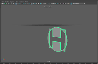
Once your logo is made, if it has any text in it, make sure you convert the type to outlines by selecting the "Type" menu on the bar up top and then selecting "Create Outlines". Otherwise, Maya wont be able to detect that something is there. After you create outlines, the text should look like the image on the right.
3. Saving your Illustrator file
Once you're ready to put your logo in Maya, save your Illustrator file as an "Illustrator 8" file. To do this, just use the menu that pops up after you save your file to whatever folder, and open the drop-down menu and select "Illustrator 8".
5. Importing to Maya
Make sure you have a new project made in Maya. Once you have your new project, go to the "create" menu, and then select "Adobe Illustrator Object", and find your file once the file viewer opens. You'll then see your logo as shown below.

At this point, you can mess with the thickness and bevel and such to your own tastes.
When you want to add color, just change the material of the object by right-clicking and selecting "assign new material". From there you can chose a material you like and then change the color in the attribute editor.
Thursday, March 23, 2017
Logo Design
Today we learned about different forms of marks and symbols and how they can used together or separately to make the "face" of a brand or company.
What is the difference between a symbol and a logo?
A logo is just words made to represent a brand. Exxon's mark is a good example of this. A symbol is a shape made to represent a brand. Apple is a good example of a symbol.
What's it called when they're used together.
When a logo and a symbol are used together, they make combination mark. Nike is a good example of a combination mark.
Key things to remember
1. Your logo will represent your entire brand
This is good to remember, because if your logo doesn't match what your brand is about, then it won't be relatable, or well liked. The shapes, colors, and fonts help decide what your logo is trying to convey
2. Simplicity is key
Logos shouldn't depend on many colors or complex forms for visual success. All of the logos above are simple, and think of how successful they are, too. Simplicity is mainly for ease in printing, but can also be visually appealing when there aren't fifty different shapes and colors popping out at you.
3. Negative space
Negative space isn't just nothing. If you use the filled space correctly, you can make memorable images through negative space. The logo shown below is a good example of utilizing negative space to create a good logo.
My favorite thing that I learned
I thought that learning the difference between marks, logos, and symbols. Not all logos are the same thing, so it's good to know the difference.
Conclusion
Logos are very important to representing a company. It's good to know the different types of logos and how they can be used.
Friday, May 13, 2016
e-Comm Final Project: Product Creation
 |
| Color Vision Logo |
What was our product?
My team's product was a pair of glasses that allows people who are colorblind to see in color. Our team name was Color Vision, and we all worked together to make different attributes of our product.Where did we excel?
I felt like my team did best on our graphics. We each worked on different graphics, while I made the logo that would go on each of our different kinds of graphics.
 |
| Glasses made in SketchUp |
Where did we struggle?
I felt like my team struggled the most with communication. We had group members that were gone often and we neglected to communicate that we would be gone, which made our group a little behind.
Things I would change or do differently:
 |
| Our group's commercial |
I would really like to have the option to choose our groups; I didn't know a lot about the people in my group and being a shy person, I didn't open up a lot to them which I feel was a disadvantage.
How did I improve?
I feel like, despite being incredibly shy as previously mentioned, I did become a little bit better at working in groups. I have never liked working in groups because I'm one of those people who likes to have things my way, but I had to deal with that and go with other people's ideas.
Labels:
Adobe Illustrator,
Animation,
e-Comm,
e9,
finals,
graphic design,
logos,
SketchUp,
Video
Monday, February 8, 2016
Introducing my personal logo
Finally!
I know; it's been three quarters of the year and I finally have a personal logo. Not my decision. This logo will later be made into a favicon for my blog as well, rather than some random image I found on Google.
Any meaning behind this?
Tons! The main thought I had for this was the idea behind the Japanese lucky cat, and how they're meant to welcome someone into a home or business. The shape the cat is holding is the coin in the traditional Japanese lucky cat, but min is larger, and has my initials on it.
Color choice?
The colors are meant to be calm and welcoming. The choice of pastels, I felt, was a good one because pastels are commonly used in things such as a child's room to make the room give off calm vibes. The pink represents love, youth, and passion, while the yellow represents sunshine. The white means purity, and is another calm color.
Why a circle?
Circles tend to represent coming together, or unity. I really liked that idea along with the soft, rounded edges to go along with the already calming colors! The spiral, which was also rounded with soft edges, is also the cat's tail, which comes around the entire circle.
Is it finished?
Most likely. I had several different ideas, both in my sketch book and on my illustrator art board. I'm pretty happy with it right now, but logos tend to change, and mine is likely no different.
Friday, January 29, 2016
Famous Logo Creation
Re-creating famous logos
Our most recent project was to find one of our favorite famous logos, and find a tutorial to help us create it in Adobe Illustrator. I chose this tutorial to help me create the well known Google Chrome logo. The tutorial went through several steps of drawing shapes with the pen tool, copying them, rotating them, and filling them in with different colors
My Chrome logo
 |
| My Chrome Logo |
What did I do this for?
We are getting ideas for our own logos, currently, and to get some insight our teacher told us to get ideas on logo creation from tutorials. We need to be able to use Illustrator better before we get started on our own logos, so the tutorials help us find new tools and commands to help us use Illustrator more easily.
Monday, January 25, 2016
Anatomy of My Name
Anatomy? For words?
Much like the human body, words have anatomy too! Typography is used to show how words and letters are made up of different parts. Some fonts have parts that other fonts don't have, like Malayalam MN (the font in the image) doesn't have serifs, but Times New Roman does.Meaning of fonts
The font you use also holds a lot of meaning. You can't write a serious Shakespearean esque poem and use Comic Sans. You need to chose a font that matches what you're writing. Fonts that are straight, have serifs, beaks, and rough edges are typically used for serious writings while rounded, spunky letters are usually used for more laid back writing.
This project
I was told to choose a font that I believed fit my first or last name. I thought Malayalam MN fit my last name rather well. Since my name is German, which is typically thought of as a strong, but not scary language, I figured I should use a font that was more serious, but didn't have things such as serifs or beaks.
Choose Wisely!
Your font choice needs to be thought out well when designing something. The font needs to match the feel and idea of what you're trying to advertise. If you were commissioned by someone to create a logo or advertisement, check with your employer to see what they're looking for. You don't want to hand them a logo that doesn't fit what they're trying to advertise.
Labels:
advertisement,
color,
fonts,
graphic design,
logos,
me,
Names,
psychology
Subscribe to:
Posts (Atom)


