Pages

Showing posts with label graphic design. Show all posts

Tuesday, May 23, 2017

End of the Year Sophomore Reflection for Graphic Design

Over the semester in Graphic Design, we did many things to become stronger with not only our design skills, but our technology, collaboration, communication, project management, and leadership skills. Being in this class helped build those skills by having us do different activities such as, presenting our work to the class, giving criticism to our classmates, creating and updating a Bechance portfolio, having an organized server folder with all our work in it, and helping others to improve by giving constructive criticism. We also spent a lot of time, well, working with graphic design. Here I am going to reflect over the many projects we did this semester.

Nelson Art Museum Poster

Our first project was to create a poster for a fake event at the Nelson Art Museum. The event was supposed to be for a art showcase of a famous artist or movement. I chose constructivism as my movement. This took a while to do, as I had to do research over the constructivism movement before I could begin working in the style. Figuring out how to relate the Nelson Art Museum to constructivism was hard, but I managed. While creating this, I learned that a lot of current art movements are inspired by constructivism, and they utilize a lot of constructivism's main properties. I was told by my teacher and by my peers that it looked almost like a movie poster, and that the layout of the poster was really well done.  I'm really proud of how this project came out in the end. I feel like it follows the constructivism style well, and that it gives the information for the event in a clear and concise way.

Quote Typography

Our next project was centered around typography. We were to look up four quotes that we really enjoy or relate to, and then make a typography artboard for each quote. I had a lot of trouble finding quotes that I liked, so I chose two from a video game that I really like, and two silly ones from some YouTubers that I watch. Along the way I learned about how type should be arranged and that certain color schemes work better with certain pieces of art. Next time I do a project like this I might try to take it a little more seriously and choose some better quotes, but I don't have all day to look up a quote I like. I didn't really like this project. I'm not a huge fan of typography, since there are so many rules that have to be followed, and a lot of precise things like kerning and different fonts.

Company Rebrand Logo 

One of our more recent projects was to rebrand a local company's logo. First we had to come up with a bunch of symbols that we thought fit the company, and then we had to come up with some lettermarks that also fit the company. Once we found the symbols and letter marks that we liked, we had to combine them to make black and white logos. This was a long project that involved researching our company to get to know what they're about and then figuring out how we could a design a logo to fit the company's purpose. I had a hard time brainstorming the first symbols we made, as we had to make a total of 30 symbols. I thought this was a little ridiculous, and it quickly turned into busywork. After we had the six symbols we liked, we had to make 6 different versions of each symbol with different color schemes, resulting in a grand total of 36 different combination logos. Usually by this point we are supposed to narrow down our choices, but instead we just had too much on our hands. However, I feel like I learned to be more patient with this project. I was getting tired of doodling meaningless logos and switching around color schemes, but I managed to make my way through. I really didn't like doing this project, but I'm happy with my final results. I feel like my logos were thought out, original, and they fit the company brand.

Business Card, Letterhead, and Envelope

This project was our final project of the year. It involved taking our favorite combination logo from our previous project, and creating a business card, letterhead, and envelope for the company that we're working on. I enjoyed this project a lot more since we didn't have to create a billion different versions of the same thing. I feel like we had a lot more creative freedom with this project, too. I did have a little bit of a hard time figuring out the information that goes on the business card, however. I was told by my peers that the pattern on the back of the business card was cute, and that the borders on the letterhead helped guide the eyes towards the actual words that may be written on the paper. I'm pleased with both the process and the outcome of this project, as I had fun and I think my designs are well done.

Over the semester in Graphic Design, I had some productivity issues. I got all my stuff turned in, but I was easily distracted by my friends. Finishing early was hit or miss for me; I either worked on extra credit assignments or worked on my own graphic design stuff, or I talked with my friends. I did, however, work outside of class in Illustrator at home if I really wanted to do more work on a certain project.

I feel like I have a strong sense of design. I'm proud of most of my projects, and I try to help others who need help making a design look the way they want.

I just really need to improve attention span. I need to find some way to stop myself from getting distracted.

Overall, Graphic Design was probably my favorite class this year. I loved getting to create art digitally. I would probably change the amount of busy work we're given, though. My biggest take-away is that all art has value, whether you're a professional in the work-force or a sophomore in high school. For next year I'd like to become less distracted so I can get more work done. I'm really excited for next year, since I'll get to learn more about graphic design.


Friday, May 19, 2017

Strawberry Hill Rebrand

Our 4th Quarter project for Graphic Design was to re-design a local company's logo. I chose Strawberry Hill Povitca as my company. I tried to make a somewhat refined logo with warm and "sweet" colors, since politic is a sweet treat
Our logo was chose from a series of 6 different combination marks, each with 6 different color schemes for a total of 36 logos that we created by hand. It was a hard choice, but I felt like this one fit the most.

I based the letterhead, business card, and envelope off of the color scheme from the logo, so that the logo wouldn't feel out of place.

The letterhead was made to look interesting on both the front and the back to keep the reader interested and make it feel like they're not just reading another letter in the mail.

The business card is meant to stand out so that the employee can get more clients.

The envelope is also meant to stand out from all the bills that a receiver may get in the mail. If the envelope looked like another bill, then the receiver may not want to open it.

My favorite part of this project was creating the business card. I've always thought business cards were really neat and professional looking, and to get to design one was a lot of fun

Overall this project was a lot of fun. I had a good time looking for a company to rebrand, and then finding the company I liked made me feel happy since I really like povitica and I've had Strawberry Hill's povitica before.

Monday, May 8, 2017

How to make a 3D logo in Illustrator and Maya

Having a nice looking logo is pretty cool, but what if it was 3D? If your logo is made in Adobe Illustrator, you can make it happen.

1. Have your logo made in Illustrator

Don't worry about color, yet. Your logo will just show up grey in Maya anyway.

2. Convert your text to outlines

Once your logo is made, if it has any text in it, make sure you convert the type to outlines by selecting the "Type" menu on the bar up top and then selecting "Create Outlines". Otherwise, Maya wont be able to detect that something is there. After you create outlines, the text should look like the image on the right.


3. Saving your Illustrator file

Once you're ready to put your logo in Maya, save your Illustrator file as an "Illustrator 8" file. To do this, just use the menu that pops up after you save your file to whatever folder, and open the drop-down menu and select "Illustrator 8".

5. Importing to Maya

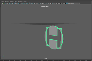
Make sure you have a new project made in Maya. Once you have your new project, go to the "create" menu, and then select "Adobe Illustrator Object", and find your file once the file viewer opens. You'll then see your logo as shown below.


At this point, you can mess with the thickness and bevel and such to your own tastes.
When you want to add color, just change the material of the object by right-clicking and selecting "assign new material". From there you can chose a material you like and then change the color in the attribute editor.

Thursday, March 23, 2017

Logo Design

Today we learned about different forms of marks and symbols and how they can used together or separately to make the "face" of a brand or company.

What is the difference between a symbol and a logo?

A logo is just words made to represent a brand. Exxon's mark is a good example of this. A symbol is a shape made to represent a brand. Apple is a good example of a symbol.

What's it called when they're used together.

When a logo and a symbol are used together, they make combination mark. Nike is a good example of a combination mark.

Key things to remember

1.  Your logo will represent your entire brand

This is good to remember, because if your logo doesn't match what your brand is about, then it won't be relatable, or well liked. The shapes, colors, and fonts help decide what your logo is trying to convey

2. Simplicity is key

Logos shouldn't depend on many colors or complex forms for visual success. All of the logos above are simple, and think of how successful they are, too. Simplicity is mainly for ease in printing, but can also be visually appealing when there aren't fifty different shapes and colors popping out at you.

3. Negative space

Negative space isn't just nothing. If you use the filled space correctly, you can make memorable images through negative space. The logo shown below is a good example of utilizing negative space to create a good logo.

My favorite thing that I learned

I thought that learning the difference between marks, logos, and symbols. Not all logos are the same thing, so it's good to know the difference.

Conclusion

Logos are very important to representing a company. It's good to know the different types of logos and how they can be used.


Monday, January 30, 2017

Constructivism Poster

Brainstorming

Recently we had to make a mock up poster for fake event at the Nelson Art Museum advertising an art movement of our choice. I chose constructivism as my movement, since it's very bold and easy to see from a distance.

Research

We had to research how to use the concepts from the movement we chose. I found that constructivism utilizes planes, rays, lines, and other bold shapes, along with basic colors such as red, blue, and yellow.

Sketching

Once we decided on our movement and did research, we had to sketch out different ideas for our poster. Looking at famous constructivist pieces help decide what might look good and catch people's eyes.

Creating the poster

Eventually, once I got down what I wanted on my poster from my sketches, I went into Adobe Illustrator and began applying what was in my sketches to my poster.

Conclusion

I really liked this project, and had enough fun making the poster, to the point where I was working on it at home too. I really wish that this was an actual event, because It would be really interesting to see.

Friday, January 20, 2017

Poster Design

The character and function of a poster

A poster's main function is to spread information, and this was very important before the internet and other means of communication. When you make a poster trying to convey information to people, it needs to be bold enough to be seen from a distance, and interesting enough so that when the viewer comes closer, they stay to find out more. What this means is that your poster needs to be seen.

The laws of poster-designing

General demands of poster-designing

Posters should attract attention on the street, and interesting enough for people to react to the message. The poster should be shocking, and make people want to know more. It should be dynamic.

Lettering in poster-designing

The lettering is a part of the picture too, and should not be ignored. Words should be able to be read quickly and give information.

Shapes in poster-designing

Shapes should draw attention. A good presentation of shapes should leave an impression on the viewer. The shapes in a poster should be arranged well, and can even use other elements such as repetition.

Color in poster-designing

Color is one of those things that has the ability to make people feel emotions. Certain colors mean certain things, and which colors you choose can determine the overall feel and atmosphere of your poster.

Key points

Just make your poster something that people will remember. The fact that posters were once a very important way of getting information around sets the idea in your mind that the visibility of your poster is important. It shouldn't be hard to read or confusing. Keep the poster simple, bold, and make sure it leaves an impression.

Friday, December 16, 2016

Graphic Design Reflection 2016

What did I do this semester?

Raccoon

Our first Illustrator project was to follow a tutorial to create a raccoon, and then make the raccoon our own by adding various different decorations and accents. Then, we incorporated our raccoon into a postcard. This took a couple weeks to complete since learning Illustrator takes a while, and designing a post card can take a lot of time and effort. Sometimes when I was using certain pathfinder tools, Illustrator just wouldn't cooperate, and I would have to find some other way around. Along the way I learned how to use a bunch of different Illustrator tools, such as path finder tools and warp effects. My peers told me that they really liked my post card, and that it was really cute. Eventually, though, I had to change the background because when it came back from being printed it was too light and it was hard to see some of the other things on the card. Overall I'm really proud of the work I did on my raccoon, and it's one of my favorite projects

Vector Portait Challenge

After we had completed our self portrait vectors, we were told to choose another person or animal that we liked, and then we had to create a vector portrait of whatever we chose. I chose a shiba inu, because they're one of my favorite dog breeds. This took my a couple days since by then I had figured out how to use Illustrator, and it was also a small project. One of my biggest challenges was getting all of the "polygons" lined up so there weren't any see-through spots on the dog. Along the way I learned how to create "low-poly" pictures in Illustrator. My friends told me that they thought it was super cute, and when I put it on another art website it became pretty popular for a little bit. I had to change some of the "polygons" since they weren't shaped like try polygons if you looked close enough, and that was bothering me. This is probably one of my best works in graphic design this year, and I'm really proud of it.

How did I use my time in class?

In class I really tried to maximize the amount of time I had in class, since there was so much to do with certain projects. I would often stay past the bell just to finish up whatever I was working on. If I finished a project early, we often had options for extra credit, so I would work on those projects. Outside of class I managed to get Illustrator at home and I really like messing around with Illustrator at home.

What are my strengths and weaknesses?

Strengths

I think that overall I'm really good at getting to work on my projects and finishing on time, and if I don't finish it on time, then I work hard to get it done as quickly as possible. I also feel like I learn quickly, and if you give me something new to do then I'll have no trouble picking it up.

Weaknesses

I often have a hard time coming up with inspiration. Almost all of my projects use the same or similar color scheme, and I feel like I could expand my horizons a little bit.

Summary

What did I love most about the semester?

I really loved just getting to use Illustrator more than I did last year. Last year I barely even got to learn how to use Illustrator, but now I know how to use it effectively.

What would I change?

I would probably change the amount of tutorials we had to do. Our teacher didn't really teach us anything, but she had us look at tutorials instead. I feel like if we had more time of our teacher actually teaching us, then our class might have done even better this semester.

Biggest take-away from the semester?

I learned a lot about project management this semester. I usually get really distracted when working on projects in other classes, but recently I've found that I've been able to just sit down and work better.

My goal for next semester.

My biggest goal is to be able to expand my design horizons. As I previously mentioned, most of my projects involve the same color schemes, and I'd like to change that.

Final thoughts.

I just feel like I've been really productive this semester. I'm super proud of everything I've done, and I've learned a lot along the way.

Tuesday, November 29, 2016

Which type of cat is best for you?

Our most recent graphic design project was to create an infographic based on whatever we wanted as long as we a did actual research on our subject. I chose to try and make a flowchart based on which breed of cat would belong with which type of person.

Concept

In the beginning I knew I wanted to do something having to do with cats. I love cats, and I've always wondered if there are certain cats that would work best with certain people. So I decided to research how the most popular house cat species behaved, and then matched up their personalities with what people might be looking for in a cat.

Process

Creating the flowchart proved to be difficult. I had all of the information down, but had trouble trying to fit them evenly in the space I had. I decided to have each box either be an inch or half an inch long, and then have them fit onto different tiers. I didn't want my flowchart to be messy and just spread out everywhere; I wanted order in my work, and I think that was what made trying to fit all of the information together hard. Eventually though, I did figure out a good layout, and filled up any blank spots with silhouettes of different cats.

My vision

When I started trying to come up with what I wanted to do, I know I wanted the final product to be cute, since I think cats are really cute and that colors that are typically deemed cute tend to be pleasing to the eye. I went with rather rather light pink colors for the different decorative pieces such as the borders around the boxes and the cat silhouettes. For the wording I chose a bolder, darker pink so that reading it would be easy. I tried to make the background simplistic so that it didn't distract from the viewers from the actual flowchart, but I added transparent white circles so that it wouldn't be boring either. I'm very happy with how my final piece came out, and I feel like it stayed true to what I initially wanted.

Thursday, October 6, 2016

Raccoon

Original raccoon
We've finally done our first major project in graphic design! We worked in Illustrator to create a raccoon, which we would eventually use to create something even greater.

The Raccoon

When we were creating our raccoon, we were told that we needed to follow a tutorial to get the basics of the raccoon down, and then follow another tutorial to add berries, leaves, or acorns. Following those guidelines, we were also allowed to add our own personal touch to our raccoons. I decided to make mine pink, because I love pink since it's just a really soft, nice color.


Postcard front

The final product

Postcard back
After our original raccoon was finished, we were then told to apply it to a postcard. The postcard was supposed to celebrate something; a holiday, party, wedding, or anything else worthy of celebration. I chose a birthday theme, since I thought that would fit with my raccoon's pink color scheme. We also needed to have some form or written typography to our postcards, so I made a design that revolved around birthdays. The postcard will be professionally printed, and I plan on giving it to a friend for her birthday.

Sharing on the web

This project has also been uploaded on Adobe's website, Behance. On Behance, I hope to get more publicity for my work. You can add certain tags to your work that allow people to search within results of what they're looking for.

Monday, September 12, 2016

Beginning Graphic Design in Sophomore Year

Back into Graphic Design

For the past couple of weeks in Graphic Design we have been closely following tutorials in photoshop to learn the different tools and features.

In this image I removed the tag from the
 coat to make the image appear more professional.

Skills

We mainly used things like content aware fill, spot healing, and clone stamp to seamlessly take out different things from photos We did about ten different assignments  with these tools and to show them all would make my post cluttered, so I've only shown one example.

This one took a while; there was a lot to
 be done, and it needed to be done correctly.

Collage

The biggest project we did by far was the collage, where we took three images of a girl and made a senior photo-type collage of her. We had to do things like remove backgrounds, restore broken parts, resize awkward proportions, and even join two backgrounds together.
I chose a more nature oriented theme for my challenge.

Challenge

Our last assignment was a "challenge". We were given an image of a model, and were told to use what we learned in the videos to create a unique edit of the model. We could use any pictures we wanted, and were only limited by our imaginations.


Valuable information

A lot of what I learned from the video tutorials felt important, but what I found to be the most helpful was learning how to use layer masks. I knew about layer masks but I never really learned how to use them and how useful they could be. You can use them to show certain parts of a layer and hide other parts, so as you can imagine, it was very nice to finally get to use layer masks.

What would I do differently?

If I had the option to do all of this again, I would have gone back and watched more closely in the videos. Most of the time I was working with Photoshop and the video open side-by-side, so I was working along with the video. Maybe if I had watched the video first, and then went to work and referred back to the video when I needed help then I would have learned more, but that's just me.

What would I leave unchanged?

I really liked how the tutorials were set up, so there's a lot I would leave the same. Maybe have more of a choice for what we got to edit, then these tutorials would be more interesting.

Overall these tutorials were very useful, and if you are planning on going into a career involving photoshop then these skills could stick with you forever. Nothing felt like it didn't make sense or wasn't necessary.

Monday, May 16, 2016

Reflection Over e9

This blog post is dedicated to reflecting over what has happened over the past first year of my time in e-Comm. It will be long but it's good to reflect over what has happened, especially when you learn as much as I have in only a year of high school.

What have I learned?

Over the past year I learned many things about how to create digital media, such as videos, websites, animations, and graphics.In regards to animation, I learned first, how to use Photoshop and how to set it up for animation, and then I learned different techniques of animation. In video, I learned how to take different shots properly, and then edit those shots to make a video that looks nice and makes sense. We did web throughout all four quarters, and in web I learned how to use Dreamweaver to make html and CSS codes to make a website that has a good color scheme and doesn't look like a mess of poor coding. In graphic design, I learned more about color theory and how different elements of design work together to make something that looks nice.

How did I learn this?

I learned by listening to my teachers when they were giving demos and writing notes. I used my notes to help me along when I eventually got to make my own project. When I forgot how to do something, I could just look at my notes to help me figure out how to do something.

Why is it important?

This is important because these skills will help me through my next three years of high school and eventually help my in a computer career if I should choose one. These skills are also nice to have if you just feel like creating something, like I really like to use Photoshop to make different things like phone backgrounds and gifs.

What are my strengths and weaknesses?

I feel like my strengths lie in using Photoshop, whether it be for animation or graphic design. Photoshop was just made really easy to use, unlike Illustrator , which I feel like it was almost made to work against you, I'm so bad at it. I feel like I do an alright job in web design stuff, and video was never really my favorite thing.

What am I doing with what I have learned?

Most of what I do with these skills involves making edits and gifs in photoshop. I like to do this for things like different video games and T.V. shows and post them on websites like Tumblr and Twitter, or Facebook if I feel like showing my stuff to my family. (I'm not on Facebook, like at all.)

What would I change?

I would kind of like to change how we're taught. Sometimes teachers will sit there and demo for the entire hour and have us take notes, and it's just about as boring as watching paint dry. I appreciate being able to take notes, but maybe we could work WHILE the teacher demos, and take notes as we go, so maybe we have something more interesting to do? It's hard to figure things out because not everyone learns the same, but these are just my opinions.

In conclusion,  I really enjoyed my first year in e-Comm. My favorite part of e-Comm has to be working with Photoshop, since it's so easy to use and you can do so much with it. I feel like I've learned a lot, and that these skills will be useful in the years to come.

Friday, May 13, 2016

e-Comm Final Project: Product Creation

Color Vision Logo
Over the past several weeks we worked in groups to come up with a product and make graphics (logo, business cards, coupons, etc.) animation, website, and commercial to advertise our product

What was our product?

My team's product was a pair of glasses that allows people who are colorblind to see in color. Our team name was Color Vision, and we all worked together to make different attributes of our product.

Where did we excel? 

I felt like my team did best on our graphics. We each worked on different graphics, while I made the logo that would go on each of our different kinds of graphics.
Glasses made in SketchUp

Where did we struggle?

I felt like my team struggled the most with communication. We had group members that were gone often and we neglected to communicate that we would be gone, which made our group a little behind.

Things I would change or do differently:

Our group's commercial
I would really like to have the option to choose our groups; I didn't know a lot about the people in my group and being a shy person, I didn't open up a lot to them which I feel was a disadvantage.

How did I improve?

I feel like, despite being incredibly shy as previously mentioned, I did become a little bit better at working in groups. I have never liked working in groups because I'm one of those people who likes to have things my way, but I had to deal with that and go with other people's ideas.

Thursday, March 10, 2016

Photoshop Projects!

So many new tools!

We recently did four different, yet similar projects in photoshop to get us used to some common tools in Photoshop. We really made use of the clone stamp tool, and magic wand tools, which are some of my favorite tools to use.

 Project 1

Our first project was to crop a picture of our school that was provided to us. After we've cropped it we would then put a semi transparent logo for our school over it, and then an acronym for Olathe NorthWest.


Project 2

our second project was to edit different colors into a monarch butterfly's wings. I chose pastel colors, because I think they're easy on the eyes. After we chose our colors, we used the clone stamp tool to make the butterfly look like its flapping its wings.


Project 3

The third project was to use another pre-provided picture of our school, and this time use the text mask tool to have a selected area that says "Northwest". After we've inverted the selection, we needed to use the gradient tool to make a blue and black gradient around the letters.

 Project 4

The fourth and final project was to make a collage of different areas in our school, and our mascot, the raven. We used the layer mask tool to make the pictures look like they were floating over the school. We also had to use the clone stamp to take out some cars and light poles that looked out of place in the photo.

What did I learn

These projects taught me very basic, yet important and widely used tools in photoshop. These tools are very important to making even the simplest edits in photoshop.

Wednesday, February 10, 2016

The Orthogonal Cube

Orthogonal Cube

A super cool shape

The orthogonal cube is a super cool shape because it's so simple, yet incredibly iconic. It's sleek, an easy to make.

I'm not just going to talk about a shape, though

I really want to talk about the e-Comm. program and how incredible it is. In e-Comm you lean a ton about how computers work and different careers involving computers, such as animation, graphic design, web design, and video.

You start out in one of those strands, with web design put in throughout the program, and learn about that strand for a quarter, then move on to the next after that quarter.

Computer skills are important

You really learn a lot in the quarter you have with each strand, and sometimes you use skills from one strand, and apply them to the next. Even if you don't plan on going into a career based around computers, these skills can still be useful to know. Maybe you're making a business and you need to design a website, or a logo. Maybe you need to make a commercial for your business with an animation in it. You can also use skills from video to make that commercial.

Don't take special programs for granted

These programs are so helpful. From e-Comm. to Animal Health, all of these 21st Century programs can help you find a career, or provide job experience. It's smart to get into a class or program that provides real life experience and skills, because in the long run, you really will find those skills useful.

Monday, February 8, 2016

Introducing my personal logo

Finally!

I know; it's been three quarters of the year and I finally have a personal logo. Not my decision. This logo will later be made into a favicon for my blog as well, rather than some random image I found on Google.

Any meaning behind this?

Tons! The main thought I had for this was the idea behind the Japanese lucky cat, and how they're meant to welcome someone into a home or business. The shape the cat is holding is the coin in the traditional Japanese lucky cat, but min is larger, and has my initials on it.

Color choice?

The colors are meant to be calm and welcoming. The choice of pastels, I felt, was a good one because pastels are commonly used in things such as a child's room to make the room give off calm vibes. The pink represents love, youth, and passion, while the yellow represents sunshine. The white means purity, and is another calm color.

Why a circle?

Circles tend to represent coming together, or unity. I really liked that idea along with the soft, rounded edges to go along with the already calming colors! The spiral, which was also rounded with soft edges, is also the cat's tail, which comes around the entire circle.

Is it finished?

Most likely. I had several different ideas, both in my sketch book and on my illustrator art board. I'm pretty happy with it right now, but logos tend to change, and mine is likely no different. 

Monday, January 25, 2016

Anatomy of My Name

Anatomy? For words?

Much like the human body, words have anatomy too! Typography is used to show how words and letters are made up of different parts. Some fonts have parts that other fonts don't have, like Malayalam MN (the font in the image) doesn't have serifs, but Times New Roman does.

Meaning of fonts

The font you use also holds a lot of meaning. You can't write a serious Shakespearean esque poem and use Comic Sans. You need to chose a font that matches what you're writing. Fonts that are straight, have serifs, beaks, and rough edges are typically used for serious writings while rounded, spunky letters are usually used for more laid back writing.

This project

I was told to choose a font that I believed fit my first or last name. I thought Malayalam MN fit my last name rather well. Since my name is German, which is typically thought of as a strong, but not scary language, I figured I should use a font that was more serious, but didn't have things such as serifs or beaks.

Choose Wisely!

Your font choice needs to be thought out well when designing something. The font needs to match the feel and idea of what you're trying to advertise. If you were commissioned by someone to create a logo or advertisement, check with your employer to see what they're looking for. You don't want to hand them a logo that doesn't fit what they're trying to advertise.

Thursday, January 14, 2016

Color!

Our first project in Illustrator was to create a color wheel! This project was designed to get us used to Illustrator and to get us thinking about color and color psychology. We were told to look up "color wheels" on google and find the simplest one and recreate that as practice first. After we created our simple color wheel we were to find a more interesting one and try to recreate that.

My Color Wheel

Mine turned out like this: To do this I made one shape, and rotated 11 copies 30 degrees around the center. We were to show the primary, secondary, and tertiary  colors.

Color Psychology

Color has a lot of meaning behind it. Different colors can mean different things and ensue different emotions. Warmer colors tend to mean things such as passion, anger, love, danger, and intensity, while cooler colors tend to symbolize calm feeling, honesty, nature, health, freshness, purity, and life.

Colors in Advertising

People will carefully choose what colors they might use in advertisements, since colors can draw people to a product. If someone's trying to sell food, they may use red for desire, and if they're trying to sell gum or toothpaste, they may use green since when people see green they tend to think of mint or freshness. People will use colors that are associated with what they're selling, to try and get people to buy their product.

Lots of Meaning

A lot of thought tends to go into color choice. Color choice is typically inspired by emotion, and a person's favorite things. Most people will just choose colors they like, but usually there's a reason they like that color so much, right? The reason my blog's all pink is because it feels like a really organized color to me, since it's such a pretty color it feels like I can do a lot with it and organize it into different things to make my page look nice. Color is one of those things that has a surprising amount of emotion and thought behind it, but once you discover this it makes a lot of sense.

Thursday, January 7, 2016

What is Graphic Design

Graphic Design is used in almost everything we do. It's used for advertisement, media, menus, brochures, comics, and so much more. Most people can find some relation to Graphic Design in everyday life.

Game Posters:

Monument Valley
One of my favorite things to do is play mobile games on my phone. Monument Valley's poster is a good example of a really great design to get people interested in a game. It's simplistic, has colors that look nice together, and a character with very little detail to them. The small amount of detail might get people curious and make them want to play the game to find out more.

What drew me to this game?

I thought the poster for this game was fascinating. It's simplistic, has colors that look nice together, and a character with very little detail to them. The small amount of detail on this character intrigued me since I've always been attached to minimalist-type objects.

Counting by 7s
by Holly Goldberg Sloan

Book Covers:

Books are another great example of graphic design's presence in every day life. Many people choose to pick up a book based simply on it's cover, which is a valid response since well design covers are one of the many things that draw people to a book.

Why did I read Counting by 7s?

As I said before, I'm attached to simple objects. The cover of this book really only consists of three colors: white, teal, and red. While the cover is very simple, the red pops out somewhat, which really made me notice it at the library.

Why does this matter?

As said before, people are drawn to what they find pretty. A well designed poster or cover can make people more likely to use your product. People try to find something they can relate to: whether it be colors they like, shapes, animals, certain settings, or maybe even just words.