Pages

Showing posts with label Animation. Show all posts

Tuesday, May 23, 2017

End of the Year Sophomore Reflection for Animation

Sophomore animation was, overall, very stressful. But I had a lot of fun in the class. My teacher was really great and the projects were interesting.

I learned a lot over the entire year. In e-Comm, we have five "guarantees":
Technology, Collaboration, Communication, Project Management, and Leadership.
  • From technology, I effectively learned how to use Adobe After Effects and Maya to make 2D and 3D animations. We were taught these programs through various tutorials that taught us the basics of each program. This information is useful because I may need to make animations for various jobs. Learning After Effects was stressful, since there were so many different options for different things in After Effects.
  • From Collaboration, I learned to better communicate with others to get group projects done through making a short animated movie with four other people. Learning to work with others is important because it happens a lot in many different careers, and if you can't work with others then you won't get very far in your career. I had a lot of issues working with others since I tend to be more shy towards those I don't know. e-Comm is helping me get over this though,
  • I learned kind of the same stuff from Communication that I learned in Collaboration. I learned to better communicate with others over projects, even if they weren't collaborative. Even if you aren't working with others, it's good to get the insight of peers so you can have a better perspective of where you're going. It's hard to reach out to the people you don't know and ask for criticism, since you never know what they're going to say.
  • Project Management taught me how to be better at keeping my files organized. Keeping a server folder and having to make sure all my files were in the right place, especially when working with After Effects helped me learn to be more organized. Being unorganized is one of the most stressful things that can happen to a person, so it's important to keep your things straight. I didn't really face many organization issues, since I'm already a rather well organized person.
  • Leadership is probably the one I learned the least from. I'm a follower by nature, and it's difficult for me to take hold of a situation for others. I'm having a hard time thinking of any leadership skills that I learned. This is troubling to me since being a leader is a really good skill to have, even if it's hard to achieve.
I've also discovered some strengths and weaknesses while taking this class. I tend to get easily distracted by my friends or other schoolwork. However, I am also a fast learner, and even when I get behind I tend to catch up rather quickly. Since this class was very stressful, I've learned to manage stress more easily and take more breaks. I still need to work on not getting distracted, though.

With everything I learned this year, I'm probably going to try and apply animation to some of my works in Graphic Design next year. Having an animated graphic could add to the interest of it.

I would probably change the order we learn some of our major skills in. We learned special effects after we finished learning Maya, but since special effects is done in After Effects, it would make more sense to learn special effects while learning After Effects.

Overall, I really enjoyed this class. I feel like it taught me to be independent, but at the same time to rely on others for help and criticism when I need it.

Tuesday, May 16, 2017

"Criticism Of The Facial Animation In 'Mass Effect: Andromeda' May Have Been Misdirected" Article Review

The article "Criticism Of The Facial Animation In 'Mass Effect: Andromeda' May Have Been Misdirected" by Kevin Murnane discusses how many people have negative opinions on Mass Effect: Andromeda's facial animations. The article first summarizes people's reactions, and then explains why the facial animations are so bad.

Murnane believes that criticisms towards the game should have been directed at Electronic Arts, the game's publishing company, rather than the animators who may have been rushed to get the game ready for release. The author states that "people at either Bioware or Electronic Arts, the game's publisher, that insisted the game be released before it was ready." (Kevin Murnane). Murnane talked with Jonathan Cooper, a lead animator on previous Mass Effect games. Cooper said that "In RPGs like Mass Effect, the player chooses among dialogue options which lead to different paths through a conversation. Rather than a single, scripted dialogue sequence there are any number of possible dialogue paths. Facial animations must be created for all of these paths" (Jonathan Cooper).

The article does a really nice job at defending the animators at Bioware, and informing people of the reasons as to why the game's facial animations are so low quality. However, Murnane compares Mass Effect: Andromeda to several other games, such as Uncharted and The Witcher 3. Mass Effect: Andromeda is a different game made by a different company, and while it's easy to compare, it's unfair since Bioware is a smaller company.

Overall, I agree with Murnane. Bioware's animators were likely not at fault here, and may have been rushed to finish the game so it could be released quickly. Bioware has been known to rush games, and were criticized for reusing assets from Dragon Age: Origins in Dragon Age 2 so it isn't rare to see this kind of criticism direct at Bioware's development team.

Monday, May 15, 2017

"Kagemono: The Shadow Folk" - Review


"Kagemono: The Shadow Folk" is a Disney animated short about a hungry fox looking for a meal. While it is searching , it runs into a fearful foe, and flees. After it runs away, the fox finds what looks like food, but is a trap! The "food" is a shadow creature that eats the fox's own shadow. Eventually, the fox's shadow is all gone and the fox has turned into a ghost. However, the foe from before comes back and eats the shadow creature, which returns the fox's shadow, and makes the fox alive again. It turns out that the "foe" just wanted to be friends. The fox and its new friend walk away into the forest together, no longer having misunderstandings of each other.

The animation is very well done and fluid. They frequently use squash and stretch to make their animations seem more lively.

The story was told through expression and actions rather than words. The animators did this very well, and made sure that everything was very lively.

The creators did a very good job at telling a somewhat dark story through cute characters. However, the world and backgrounds seemed very bleak, and could use more color.

Overall, I feel like the story was very well told, and that their animations were fun to watch. It wasn't boring in any way.

Tuesday, May 9, 2017

Explosion

This is a fake explosion applied to a video clip made in After Effects.

Scope of the project (goal)

One of our more recent projects was to learn elements of special effects through applying an explosion using various resources given to us to a provided video clip.

Process

To do this we had to learn by watching a video tutorial. If we followed along with the tutorial and did exactly as the instructor said, the final product generally came out looking pretty nice. I had a little bit of trouble figuring out timing on certain things, such as when to have the smoke come in after the explosion, or when the debris should hit the ground.

What did I learn?

While doing thisI learned how to better organize layers in After Effects. For this to work, you really need to have your layers in the right place, and doing that helped with my organization

What would I do differently?

I would probably try to fix some things with the timing, and try to add a camera shake of some kind. I can't really do anything about the people ignoring the explosion, but it would be cool if there was some kind of reaction.

What would I keep the same?

I like how my lighting came out, with the flash of light that reflects on the wall and overhangs of the building, so that's probably what I would keep.

My experiences

After completing this project, I feel like my files could be more organized and also now I know how to apply lighting while editing, rather than having to put some pieces of lighting in during filming.

Thoughts and conclusions

This project was really easy and fun for me. I like having a video to follow when I'm learning something new, since you can go back if you miss something.

Monday, May 8, 2017

How to make a 3D logo in Illustrator and Maya

Having a nice looking logo is pretty cool, but what if it was 3D? If your logo is made in Adobe Illustrator, you can make it happen.

1. Have your logo made in Illustrator

Don't worry about color, yet. Your logo will just show up grey in Maya anyway.

2. Convert your text to outlines

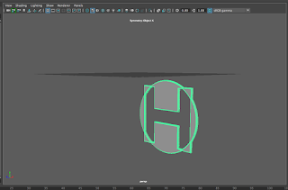
Once your logo is made, if it has any text in it, make sure you convert the type to outlines by selecting the "Type" menu on the bar up top and then selecting "Create Outlines". Otherwise, Maya wont be able to detect that something is there. After you create outlines, the text should look like the image on the right.


3. Saving your Illustrator file

Once you're ready to put your logo in Maya, save your Illustrator file as an "Illustrator 8" file. To do this, just use the menu that pops up after you save your file to whatever folder, and open the drop-down menu and select "Illustrator 8".

5. Importing to Maya

Make sure you have a new project made in Maya. Once you have your new project, go to the "create" menu, and then select "Adobe Illustrator Object", and find your file once the file viewer opens. You'll then see your logo as shown below.


At this point, you can mess with the thickness and bevel and such to your own tastes.
When you want to add color, just change the material of the object by right-clicking and selecting "assign new material". From there you can chose a material you like and then change the color in the attribute editor.

Thursday, March 30, 2017

Plausible Impossible

In Disney films, there are many examples of the plausible impossible, where something impossible seems possible in a given situation. Here are some examples of plausible impossible from a version of Alice in Wonderland with Mickey Mouse.

1. Walking through a mirror

In this scene, Mickey walking through a mirror seems plausible because of how the mirror stretches to let him in. If he just walked through the mirror and the mirror didn't react, it would seem like Mickey was a ghost, and he just phased through the mirror.

2. Living objects

Disney makes it seem possible that inanimate objects could be alive by giving them human-like features. The phone has arms, and the mic became its mouth.

3. Mickey being shuffled into a deck of cards

It would be impossible to shuffle an object with form into a deck of cards, but Mickey fits in because of how they show him being shuffled into the cards. They treat him like he's another card, which helps him fit in.

4. Mickey dancing with a card

Mickey can dance with a card because hey had the arms and legs come out of the card. It wouldn't make much sense if Mickey was dancing with a card that had no arms or legs. This is similar to the one with the phone having human-like features.

5. Mickey shooting ink out of a pen

Ink typically can't be shot out of a pen like this, but having Mickey hold the pen like a gun makes this seem possible, and the viewer even expects Mickey to use the pen as a weapon.


Friday, December 16, 2016

Animation Portfolio Reflection 2016

Worm

One of the first projects we made in animation was using the puppet pin tool in After Effects. What we did was first draw a worm in Photoshop, and then import the image into After Effects. Then we used the puppet pin tool to apply spots where the worm could move, and used key frames to make it look like it was moving. I picked this project because it was the project that really taught me how after effects works with the key frames and such. I feel like I did a really good job on drawing the worm in Photoshop, but I could have done a better job on where I placed the puppet pins, because at some points in the animation the worm does some weird stuff with his body. With what I learned for this projects I'm probably going to try and use the puppet pin tool more, since I don't really use it that often. I really like this project because I like what I made the worm look like.


Walk Cycle

When we made our walk cycles I learned how to time animations and how to set up key frames for a walk cycle. I picked this project because I'm really proud of my characters design and the background. I feel like I did a lot of work on my character's design. I probably could have made her less stiff though, since she doesn't move a lot. I'm going to apply more walk cycles to my animations with what I learned when making this animation. This is probably one of my favorite projects, just because of my characters design and how much work I put into the whole animation.


Hammer

After we were done with After Effects, we started using Maya. The hammer wasn't my first Maya project, but it was probably our first major one. Here we learned how to use the multi cut tool and the extrude tool by making our hammer's head and the part that comes out on the back. I picked this project because even though it was stressful, I was really proud of what I had made in the end. My greatest strength with this project was probably making the nails, since I didn't have any instructions on how to make the nails; I just did it on my own. With what I learned here I'm able to use the extrude and multi cut tools more easily since I know how they work now.


Ice cream

When we made our ice cream, the only really new thing we learned was how to add bump maps to our materials, which adds a sense of depth and texture to your objects. We also learned how to animate in Maya, but that was pretty easy as it uses key frames just like After Effects did. We put the bump maps on the ice cream and the cones. For a while my bump maps would move awkwardly while it spun, so I needed to figure out how to make them spin with the rest of the objects. I feel like I could have done something to make the lighting better, since it's really dark in my scene. 


Pen

Our most recent project, and also part of our final, was to model the pen we were using to take notes in class. Luckily, I had a pretty easy pen to model. When I was making my pen, I didn't really learn anything new, since we were using skills we had already learned, but I may have figured out easier ways to do certain things. I picked this project because it's probably the thing I'm most proud of from this semester. I think I did a really good job on making the pen proportionate to what it looks like in real life, but I feel like I could have done a better job on making the clip part of the cap. Making this pen has really helped me be more independent in Maya, since we didn't have a tutorial or anything on how to make a pen, since we all had different pens.

Sunday, December 11, 2016

Artificial Intelligence Generated Animation

A critique of this article by Selina Cheng.

Recently, famed animator Hayao Miyazaki was shown an animation which was generated through artificial intelligence. The animation showed strange movements, some of which had "zombies" crawling across floors in grotesque ways. Miyazaki expressed extreme discomfort and disappointment when he remembered a friend who has a disability, and has problems simply trying to give high-fives. He believes that this form of animation is "an insult to life itself" and that the people who created it have no idea what true pain is.

My thoughts

Cheng believes that Miyazaki's reaction isn't that surprising, as many of his works display characters with a lot of depth to them, abd are based on
"progressive themes like war, environmental issues and feminism".

Cheng's article is short and to the point. The issue- Miyazaki's opinions on AI animation- is clear. The article, however, lacks much of a conclusion other than stating Miyazaki's plans for coming out of retirement. Cheng also didn't seem to take a side on the matter, and only displayed Miyazaki's thoughts. The fact that Cheng doesn't think Miyazaki's reaction is surprising may mean that she agrees with him, and finds his opinions easy to understand.

I feel as though Miyazaki's thoughts should be taken into consideration. He did have a very extreme reaction, but the point he made of his disabled friend is important, and people should be careful when they create AI programs.

Conclusion 

Cheng's article helped shed some light on Miyazaki's thoughts. Though without the inclusion of the video, the article might have not made much sense.


Saturday, December 10, 2016

Potion Shop Review

Potion Shop

Potion shop is a thesis film by Temmie Chang. While Chang did the animation, she had the help of many others, including Toby Fox, who composed the original piece playing in the background of the animation. Chang's animation tells the story of a cat who runs a potion shop, but seems to be having issues getting any business until she saves the day by driving off a young dragon. Though all seems well, it is not, and the cat goes to make amends with the dragon, and in the process make new friends. The story is told through great character design and personality, talented animation and an expressive soundtrack.

Thoughts

The first thing that really stands out to me about this short film is the colors. The colors Chang decided to use really fit well with the given situation, and when the plot turns darker, the colors follow suit. On my next project this is something I would like to try and use, as I thought it really brought out parts of the story.

I also noticed that Chang used a multi-plane when showing the town at the beginning of the story to give depth to the animation. This is one of the first things we learned in class, and it really helps to show that different parts of the scenery don't all move together, and are further away from one another.

I feel as though when the crowd was shown running up to the cave, Chang could have improved that bit by animating the crowd a little more than just having them as a mass of color moving towards the cave. This is something I noticed is common in American animation, and it may have been an issue with time since Chang seemed to imply that this took a while to make in the description of the film.

Conclusion

Overall, I thought that this short film was super cute, and really well told. The colors and design were appealing to the eye, the soundtrack was fantastic, and the story was interesting. Chang's other work seems to all be really well made too, and I'm excited to see more from her.

Thursday, December 8, 2016

How to create an insect/arachnid walk cycle in After Effects

Creating a walk cycle for a creature with more than two legs may seem difficult, but its as simple as making a human walk cycle, with just a few extra steps.

1, Have a creature with 6 or 8 legs

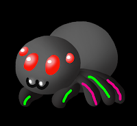
I will be using my spider from my story animation. I know my spider looks like it has only 5 legs but that's because the other 3 legs are behind the rest of the body, so I decided not to show them. It doesn't really matter if it has 6 or 8 legs, because the middle pair of legs will just be able to move on its own. I have highlighted the legs that will eventually be paired together, since arachnids and insects legs move like human legs, but in pairs.

2, Pairing the legs

The legs can be paired together using the whip tool in After Effects. Drag the whip tool from the middle green leg to the front green leg, and the back pink leg to the middle pink leg. Now when you set up your key frames on the first and second legs, all of the other legs will follow.

3, Key frames

The key frames on a walk cycle make the shape of a "D" on its side when looking at the path. Create a key frame where the first leg is moved to the right a bit, then another with the leg moved up and to the left, then another with the leg moved down on the same plane as the first key frame to the left. Copy and paste the first key frame so that  the leg goes back to where it originally was. You now have a full cycle.

4, Copying and pasting key frames

Once you have your key frames for the first set, all you have to do is copy and paste the frames from the first set to the second set, and then move them so that those frames start in the middle of the first frames, so that your legs don't move at the same time. If you make more copies of the frames you can have a longer walk cycle.

5, Watch your walk cycle

Your walk cycle should look similar to mine. Notice that the legs move opposite of each other. I hope this tutorial helped!

Thursday, November 10, 2016

Story Animation

Another thing we did recently (before we learned about Maya, actually) was create our first story animation with After Effects. This was, by far, one of the biggest and most stressful things I've done in all of e-Comm so far, other than the big group projects we did last year, but I'm proud that I powered through and proud of my work.

Pre-Production

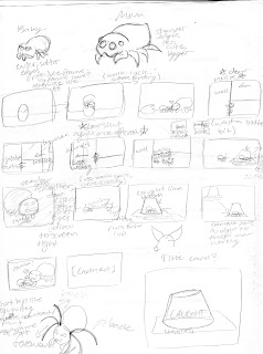
My storyboard
When our teacher first told us that we would be writing a short story, and then animating it, I had millions of ideas flying through my head. My main thought was that I wanted something cute. I remembered a spider that I had found in my bathroom several days prior, and how I had put them on a piece of paper, under a cup, and let him outside. I thought of what might have been going through the spider's mind, and what they thought when they got outside. I realize that spiders don't raise their offspring, but keeping with the "cute" theme, I thought up a small spider family, made up of a mother and child, living in a human's bathroom.

Production

Storyboarding for this was fun; I love spiders and I love drawing them. I really liked the way my designs looked on paper, but unfortunately my digital art skills aren't as good and they didn't translate well onto the computer. My story, however, was overshot. I set my standards a bit too high for myself and my abilities. I had to shorten and simplify my story once I hit production because of time limitations, which made me a bit upset, but what can I do when it's my first major project in my sophomore year of high school animation.

Trouble with After Effects

Finished baby spider design
Another bit that made creating this so stressful was working with After Effects. After Effects was easy for me to manage when I had a few different layers and such, but once you throw in more than one character, backgrounds with five plus layers, and multiple different scenes, things get troublesome. Once I had finished creating my backgrounds and characters, I needed to figure out a way to put it all together into a story, which was very overwhelming. Eventually, I calmed down and thought it through. The final project did eventually come out and I'm very proud of the work I've done for my first big project in this class.

Post-Production

After almost everyone else in class had finished their animations, we watched and critiqued each other. There were no harmful words towards each other, only what we liked, and thought needed work on our animations. I was told that mine was well done, though there were somethings that I needed to fix, such as some timing issues and objects that didn't fit the aesthetic of the rest of the animation. Unfortunately I wasn't able to get to any of these things since I had deadlines to meet.

Conclusion

I really wish I had set my standards lower for myself. That was probably the main cause of my stress, and the rushing of my project. I'm proud of myself for having overcome my stress and finishing the project, but I'm upset that I almost let the stress get to me. For our next big project I'll probably try to take things easier on myself and try to stay after and work on things at school.

Castle

My castle.

New program

Recently in animation we've been learning about Maya, a 3D modeling program. There's a lot that goes into Maya and learning how to use it, so we started out small and created a simple castle. 

Learning Maya

In order to learn to make the castle, we needed to first learn how to use Maya. We started out by learning what makes up shapes in 3D programs-- polygons. There are different simple shapes in Maya, such as the cube, sphere, and pyramid. These shapes are put together and modified to create more complex shapes, much like my castle.
A better look at the towers and moat.

Building the castle

The castle was our way of putting our knowledge of simple shapes into making complex shapes. We started out with a simple cylinder, which we then cut an area out of for guards or soldiers to stand with blocks extruding up from the top of the wall. Once we were done with one tower, we could copy and paste it to create three more. The walls were then added by creating a rectangular prism that was connecting two of the towers at the height you want your wall to be. After we made the base of the wall, we made subdivisions to have extruding out the top, much like the towers. We could then copy and paste the wall three times like we did with the towers and make a cube to cut out the gateway with.

Extra editions

After the base castle was built, we needed to add something extra. I decided to make a ground and a moat by making a rectangular prism and cutting out a hole, and then making another rectangular prism as the island the castle sits on.

Sand and water

Adding the textures was fairly simple, since all I needed to do was set up a shader to create some sort of depth, and then add a texture to said shader. I chose sand, to make my castle appear like a sand castle. The water texture and shaders were already built into Maya, and I didn't need to do any searching for textures.

Last thoughts

Creating the castle really helped me learn a lot about modeling in Maya. Currently, we are just beginning to learn about lighting, which has made my projects look a lot more life-like than what was seen in my castle's images.

Monday, May 16, 2016

Reflection Over e9

This blog post is dedicated to reflecting over what has happened over the past first year of my time in e-Comm. It will be long but it's good to reflect over what has happened, especially when you learn as much as I have in only a year of high school.

What have I learned?

Over the past year I learned many things about how to create digital media, such as videos, websites, animations, and graphics.In regards to animation, I learned first, how to use Photoshop and how to set it up for animation, and then I learned different techniques of animation. In video, I learned how to take different shots properly, and then edit those shots to make a video that looks nice and makes sense. We did web throughout all four quarters, and in web I learned how to use Dreamweaver to make html and CSS codes to make a website that has a good color scheme and doesn't look like a mess of poor coding. In graphic design, I learned more about color theory and how different elements of design work together to make something that looks nice.

How did I learn this?

I learned by listening to my teachers when they were giving demos and writing notes. I used my notes to help me along when I eventually got to make my own project. When I forgot how to do something, I could just look at my notes to help me figure out how to do something.

Why is it important?

This is important because these skills will help me through my next three years of high school and eventually help my in a computer career if I should choose one. These skills are also nice to have if you just feel like creating something, like I really like to use Photoshop to make different things like phone backgrounds and gifs.

What are my strengths and weaknesses?

I feel like my strengths lie in using Photoshop, whether it be for animation or graphic design. Photoshop was just made really easy to use, unlike Illustrator , which I feel like it was almost made to work against you, I'm so bad at it. I feel like I do an alright job in web design stuff, and video was never really my favorite thing.

What am I doing with what I have learned?

Most of what I do with these skills involves making edits and gifs in photoshop. I like to do this for things like different video games and T.V. shows and post them on websites like Tumblr and Twitter, or Facebook if I feel like showing my stuff to my family. (I'm not on Facebook, like at all.)

What would I change?

I would kind of like to change how we're taught. Sometimes teachers will sit there and demo for the entire hour and have us take notes, and it's just about as boring as watching paint dry. I appreciate being able to take notes, but maybe we could work WHILE the teacher demos, and take notes as we go, so maybe we have something more interesting to do? It's hard to figure things out because not everyone learns the same, but these are just my opinions.

In conclusion,  I really enjoyed my first year in e-Comm. My favorite part of e-Comm has to be working with Photoshop, since it's so easy to use and you can do so much with it. I feel like I've learned a lot, and that these skills will be useful in the years to come.

Friday, May 13, 2016

e-Comm Final Project: Product Creation

Color Vision Logo
Over the past several weeks we worked in groups to come up with a product and make graphics (logo, business cards, coupons, etc.) animation, website, and commercial to advertise our product

What was our product?

My team's product was a pair of glasses that allows people who are colorblind to see in color. Our team name was Color Vision, and we all worked together to make different attributes of our product.

Where did we excel? 

I felt like my team did best on our graphics. We each worked on different graphics, while I made the logo that would go on each of our different kinds of graphics.
Glasses made in SketchUp

Where did we struggle?

I felt like my team struggled the most with communication. We had group members that were gone often and we neglected to communicate that we would be gone, which made our group a little behind.

Things I would change or do differently:

Our group's commercial
I would really like to have the option to choose our groups; I didn't know a lot about the people in my group and being a shy person, I didn't open up a lot to them which I feel was a disadvantage.

How did I improve?

I feel like, despite being incredibly shy as previously mentioned, I did become a little bit better at working in groups. I have never liked working in groups because I'm one of those people who likes to have things my way, but I had to deal with that and go with other people's ideas.

Wednesday, February 10, 2016

The Orthogonal Cube

Orthogonal Cube

A super cool shape

The orthogonal cube is a super cool shape because it's so simple, yet incredibly iconic. It's sleek, an easy to make.

I'm not just going to talk about a shape, though

I really want to talk about the e-Comm. program and how incredible it is. In e-Comm you lean a ton about how computers work and different careers involving computers, such as animation, graphic design, web design, and video.

You start out in one of those strands, with web design put in throughout the program, and learn about that strand for a quarter, then move on to the next after that quarter.

Computer skills are important

You really learn a lot in the quarter you have with each strand, and sometimes you use skills from one strand, and apply them to the next. Even if you don't plan on going into a career based around computers, these skills can still be useful to know. Maybe you're making a business and you need to design a website, or a logo. Maybe you need to make a commercial for your business with an animation in it. You can also use skills from video to make that commercial.

Don't take special programs for granted

These programs are so helpful. From e-Comm. to Animal Health, all of these 21st Century programs can help you find a career, or provide job experience. It's smart to get into a class or program that provides real life experience and skills, because in the long run, you really will find those skills useful.

Thursday, October 8, 2015

3D House Model

Our most recent project in Animation was to create a 3D model of a house in SketchUp, and then animate a camera flying around it. We were to choose a one story house that wasn't to simple, and create it as close as we could to the original.

Tuesday, September 22, 2015

Handwritten Name Animation Tutorial


What am I teaching you?

I will be teaching you how to create an animation of your name being handwritten! This will involve several layers, a frame animation set up, erasing bits of your name, and several different affects being used.

Where to begin?

Start by creating a new file in Photoshop, measuring 600x150 pixels, not inches or whatever else may be an option. Choose a font that you like and type your name rather large in the 600x150 space. You may need to crop the image later to make it fit better.

Rasterizing your type


After you have typed your name and cropped as needed, rasterize the type so it is erasable. To do this, right click the layer, and simply select "rasterize type" so you can erase it. After your text is rasterized, you may begin erasing.

Erasing


Begin erasing your name in a way that is the reverse of writing it out, and each time you erase a bit of your name, create a duplicate of the layer you are currently on and hide the previous layer. I started at the top right start of the "V", because in the english language we tend to write from left to right, but remember: this is going to be like reversing the action of writing out your name! Do not start from the right! Don't forget to duplicate layers and hide the previous layer! It is also VERY important to save after every major step, so if you make a mistake then you can restart from your previous save that you created.

After you have erased it all it should look something...


Like this! It looks like nothing, but remember you have your large number of layers, which will become your frames.

Animating

On the frame animation window, click the little menu on the upper right hand corner of the window, and select make frames from layers. This will create frames from all of your layers. You may need to make the background visible on each frame, and to do this all you need to do is select all the frames, and click the little eye thats on the background layer, and it will be visible on each frame. You may also need to delete some frames, like any blank layers at the end will need to be deleted.


Your Photoshop window should look something like this, with a bunch from layers to the right, and frames on the bottom in the animation timeline. But! Your frames are backwards, and if you play your animation, it will look like you're erasing your name! To fix this, select all your frames, click the little menu we used to make our frames, and select reverse frames, as seen in this image:


Tweening

Now, your animation may seem a little boring, just being written out, and nothing happening at the end. If you would like, you may add some effects to the end of the animation! To do this, select the end layer that is your name completely written out, no erasing done yet. Click the little "fx" button at the bottom of the frames window, and mess around with these effects. I will show you how to do outer glow, for this tutorial.


Mess around with the settings of the outer glow effect, until you get something that looks something like this:

A light glowing around your name! As described by the name of the effect. But you need to animate the effect in so it doesn't just suddenly appear on the last frame. To do this, select the frame with the effect, and then click the little menu on the upper right hand corner of the animation window and select tween, above the reverse frames button we used earlier


Once you have selected that, a window will pop up and have several different options to choose from. I just used these settings. Make sure you're tweening with the previous frame.


This should create 5 new frames between the effect frame, and the frame without the effect, making it look like the effect is fading on to the screen. Don't forget to save after all of this!

Saving


If you would like to save as a .GIF file, then go to file on the upper left corner of the screen, and go down until you find "save for web". Click this and a window will come up.


In this window,  set the preset as "GIF 128 No Dither" and leave everything else as is. The preset will select all the things you need without you needing to do anything. You can preview the animation by selecting the play button in the lower right corner, above the done button. Once you are done setting the preset, click save, and your animation should be saved to whatever folder you chose to save it to. Once it's saved and you have opened it, your animation should look like this:


The End!

You're done! Hopefully you are pleased with your outcome. If you think something might be wrong, then go back to your previous saves and check to make sure you did everything. You might not get everything correct the first time, so keep trying if you don't!


Thursday, September 17, 2015

Animation of My Ten Words


You may have seen the ten words on the right side of my blog. They may seem rather strange, but they were meant to be words that describe me.We recently finished another animation, where we were supposed to animate these ten words and our name. Though this time instead of a frame animation, it was a video animation! Video animations are much different from frame animations. You don't need a frame for every single movement in the animation, but instead you only need a frame for each thing you want to move. You need to create key frames, and between each key frame in the animation, the object will do what you have set it up to do. I think video animations are a bit more confusing than frame animations, but they're both not very difficult to create.

Wednesday, September 2, 2015

Progressing Through E9 Animation


We've started and finished another animation, similar to the previous one. Only this time, it isn't bouncing up and down, it's bouncing from left to right and rolling off the screen! We were told to create an animation of a ball with a smiley face bouncing in an arcing path across our name written in large text at the bottom of the screen. Again, we were told to use squash and stretch to show speed of movement, and to set frames further apart to show the object actually moving faster. This time, since the ball has a face, we were to give it some emotion as it hit the ground, so that its face squashed a little bit, and its eyes closed. Another thing we did, was give something for the ball to do once it was done bouncing. It could have faded into the background, bounced up off-screen, or rolled away, like mine did. Anything to get the ball off screen would work. This was done to make the animation loop more smoothly, rather that abruptly stopping and starting at the top again, with no explanation as to how it got there. I believe that I've improved since my last animation, and that my squashing and stretching on my last animation was a little too exaggerated. This time I tried not to overuse squash and stretch, which I think I succeeded at.

Wednesday, August 26, 2015

My First Animation!

Over the past two days we learned how to animate in photoshop. With what we learned, we created our first animation: a bouncing ball!

We were taught how to make the ball appear to go faster, by setting the ball further apart in each frame, and how to make the bouncing seem more realistic, by stretching it vertically as it falls down and comes back up, and squashing it as it hits the ground.